One of the most important statement in a project finance model is the sources and uses of funds during construction. It is composed of two sections:
Uses of funds statement shows the total cost of a project with an explicit and meaningful breakdown of costs. It identifies the total financing required for a project.
Sources of funds statement lists the financing facilities that have been identified as available to meet the cost.
The summary sources and uses of funds table appears in most project documents and should also be included in the summary sheet or dashboard within the financial model.
It is also useful to include a chart to visualize the main items in the total project and the financing plan.
I used to include pie charts to visualize the summary S&U in my project finance models but then when you have a relatively detailed line items in the breakdown of costs, then the pie charts becomes difficult to read.
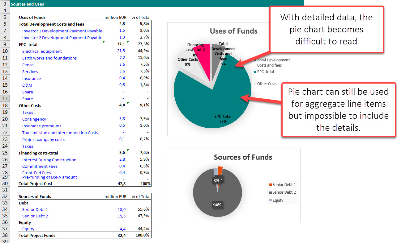
The next best alternative is bar chart. Getting a nice looking chart with descending or ascending order require some work.
Follow the below steps to create a good looking bar chart for your Dashboard.
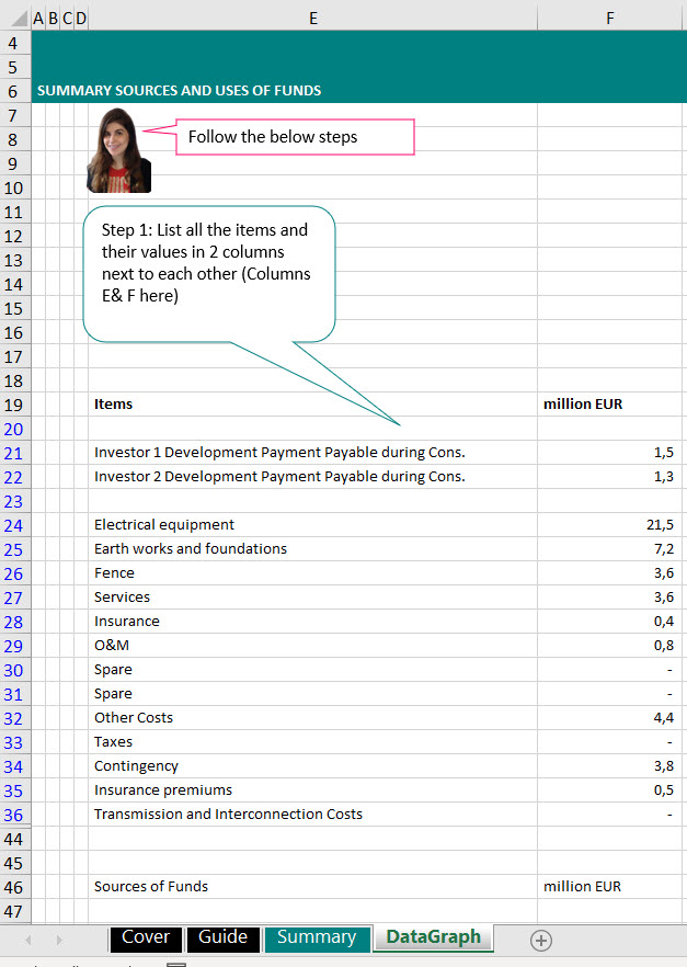
Step 1: List all the sources and uses of funds items and their values in 2 columns next to each other.
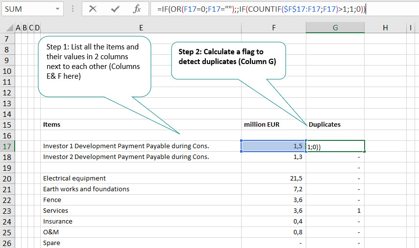
Step 2: Create a flag to detect the duplicate. The issue with the Rank() function is that if you have 2 cost item with the same exact value then it will rank them the same and only one will appear in the ranking. So before ranking, we want to first identify duplicates and then in the next step multiply by a very small number just to avoid having missing items in our bar chart.
I am using the below function which I am borrowing from Extend Office (Link)
=IF(OR(F21=0;F21=””);;IF(COUNTIF($F$21:F21;F21)>1;1;0)).
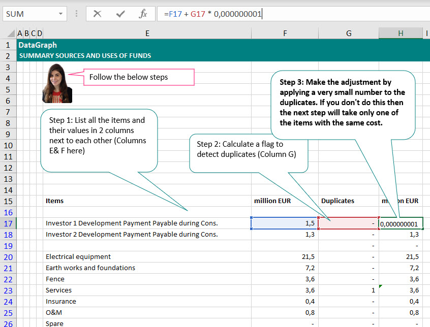
Step 3: Adjust the duplicate by a small value by multiplying the cost of the duplicate item by a very small value.
Step 4: Now rank the adjusted values
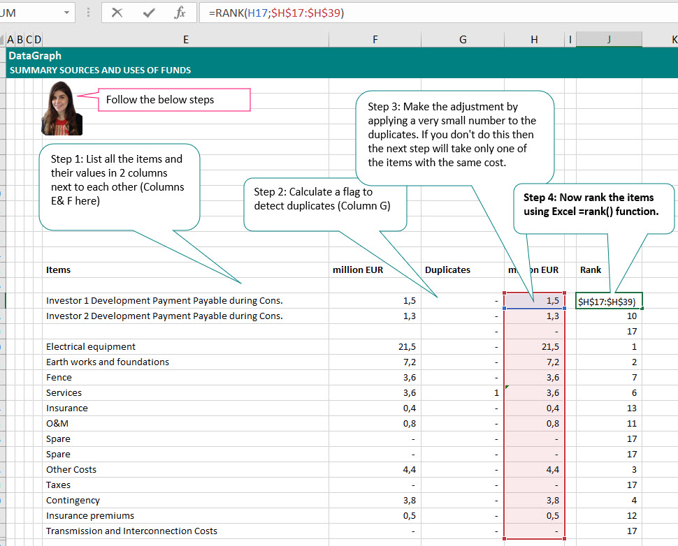
Step 5: Create a counter in either ascending or descending order
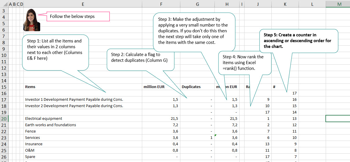
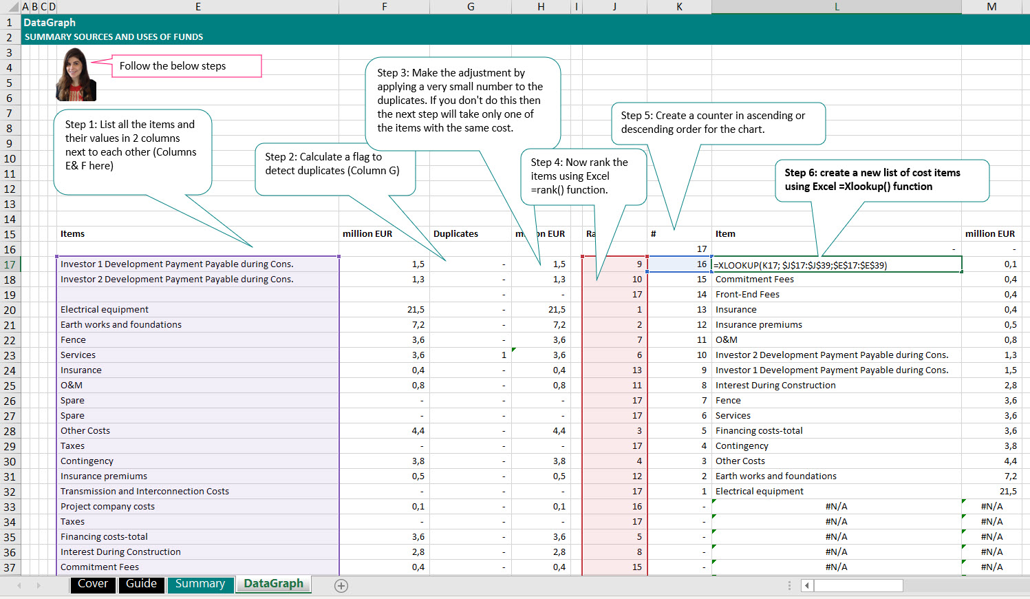
Step 6: Look up for cost items to be ranked in either ascending or descending order by using Xlookup() function for both labels and amounts
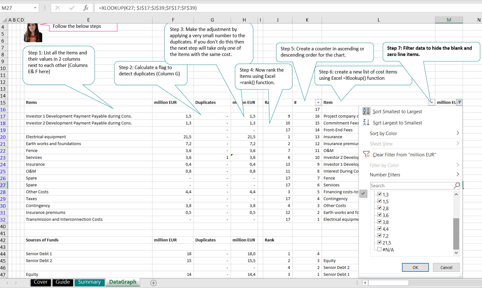
Step 7: Use the filter in Excel to hide the blank and items with 0 value
I am sure there are multiple ways of doing the same but just wanted to share with you how I visualize the summary sources and uses of funds in my project finance models.
You can download the Excel spreadsheet from the below link:
Now, I would love to hear from you. Let me know in the comment section :
- Which chart is a great way to visualize the sources and uses of funds in your project finance models?
- What are the other charts you include in your project finance dashboards or summary sheet?
Until next time, take care and keep modeling.
Best regards,
Hedieh


